library(tidyverse)
library(effectsize)
library(emmeans)
load('data/chicks-20d.RData')
load('data/longevity.RData')Lab 6: Analysis of variance
With solutions
ImportantBefore you begin
Fill in the author and calpoly-id fields at the very top of this file. Replace "Your Name Here" with your full name and "yourpolynetid" with your Cal Poly username (the part of your email before @calpoly.edu, e.g. jdoe01). Your submission cannot be matched to your record without this.
Where a “Your turn” asks you to save a result by a specific name (shown in bold), use the exact name given — your work is checked automatically.
The goal of this lab is to practice fitting ANOVA models in R. We’ll use the chicks dataset (chick weights at 20 days by diet group) to illustrate, and you’ll apply the same steps to data on caloric restriction and longevity in mice.
Preliminaries
What do the diet groups look like?
Side-by-side boxplots by group use a ‘formula’ y ~ x, read as “y depends on x” or “y by x”, together with data containing the variables named in the formula. The response variable goes on the left, the grouping variable on the right:
boxplot(weight ~ diet, data = chicks)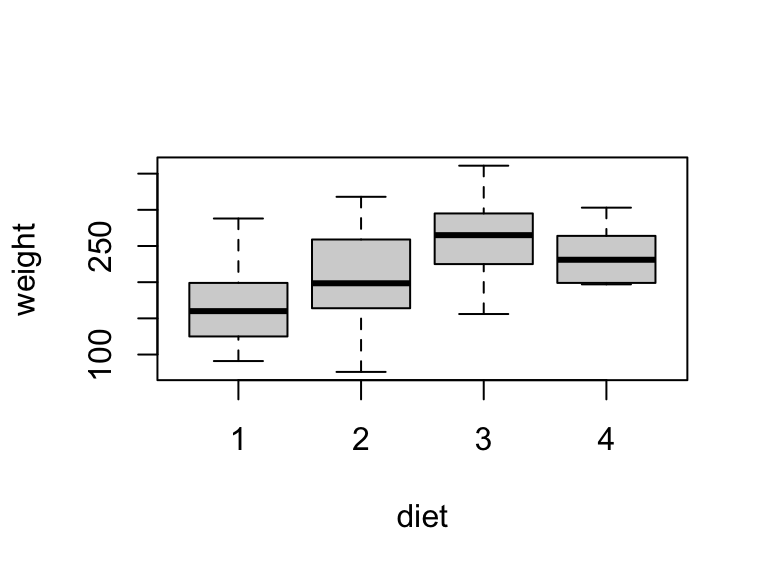
Distributions look roughly symmetric with similar spread across groups — ANOVA assumptions seem reasonable here.
What do the caloric restriction groups look like?
CautionYour turn 1 [L3]
The longevity dataset contains lifespans (in days) of lab mice randomly assigned to one of four calorie-restricted diets. Produce a side-by-side boxplot of lifetime by diet and briefly assess whether ANOVA assumptions seem reasonable.
TipSolution
boxplot(lifetime ~ diet, data = longevity)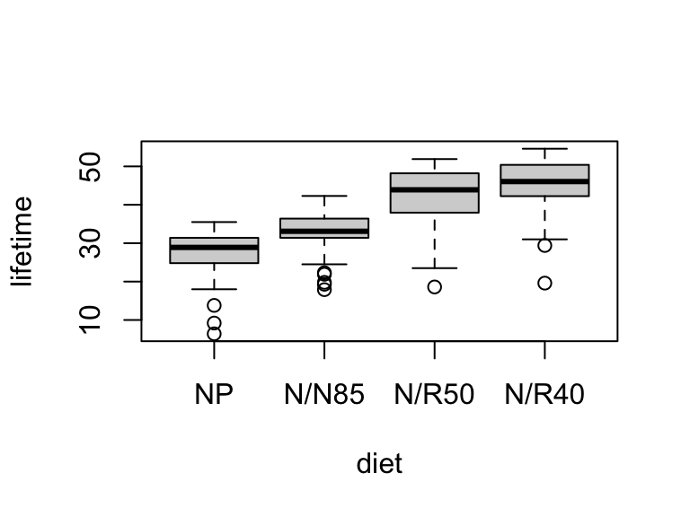
Distributions are roughly symmetric with similar spread across groups and no extreme outliers. ANOVA assumptions look reasonable.
Analysis of Variance
Fitting the model and ANOVA table
Is there an effect of diet on chick weight?
Fit the model with aov() and pass it directly to summary() to get the ANOVA table:
fit.chicks <- aov(weight ~ diet, data = chicks)
summary(fit.chicks)
Df Sum Sq Mean Sq F value Pr(>F)
diet 3 55881 18627 5.464 0.00291 **
Residuals 42 143190 3409
---
Signif. codes: 0 '***' 0.001 '**' 0.01 '*' 0.05 '.' 0.1 ' ' 1The test is significant at the 1% level (F = 5.46 on 3 and 42 df, p = 0.00291):
The data provide evidence that diet has an effect on mean weight among chicks.
Does caloric restriction affect lifespan in mice?
CautionYour turn 2 [L9]
Test for an effect of diet on mean lifespan in the longevity dataset at the 5% level. Fit the ANOVA model using aov(), store it as fit.longevity, and print the ANOVA table using summary(). Interpret the result in context.
TipSolution
fit.longevity <- aov(lifetime ~ diet, data = longevity)
summary(fit.longevity)
Df Sum Sq Mean Sq F value Pr(>F)
diet 3 11426 3809 87.41 <2e-16 ***
Residuals 233 10152 44
---
Signif. codes: 0 '***' 0.001 '**' 0.01 '*' 0.05 '.' 0.1 ' ' 1The data provide strong evidence that caloric restriction affects mean lifespan in mice (F = 87.41 on 3 and 233 df, p < 0.0001).
Estimating effect size
How much of the variation does diet explain?
\(\eta^2\) (eta-squared) measures the proportion of total variation attributable to group differences. The eta_squared() function computes it directly from the fitted model:
eta_squared(fit.chicks, partial = FALSE, alternative = 'two.sided')# Effect Size for ANOVA (Type I)
Parameter | Eta2 | 95% CI
-------------------------------
diet | 0.28 | [0.05, 0.46]With 95% confidence, diet accounts for an estimated 8% to 43% of total variation in chick weights at 20 days.
How much variation in lifespan does diet explain?
CautionYour turn 3 [L9]
Estimate the effect size of diet on lifespan for the longevity model. Use a two-sided 95% confidence interval and interpret it in context.
TipSolution
eta_squared(fit.longevity, partial = FALSE, alternative = 'two.sided')# Effect Size for ANOVA (Type I)
Parameter | Eta2 | 95% CI
-------------------------------
diet | 0.53 | [0.44, 0.60]With 95% confidence, caloric restriction explains an estimated 46% to 59% of total variation in mouse lifespan — a large effect.
Post-hoc comparisons
Which pairs of means differ?
Which diets produce different mean weights?
A significant omnibus F test tells us that some means differ, but not which ones. Post-hoc pairwise comparisons address this by testing all pairs of group means, with p-values adjusted for the number of comparisons. The emmeans package makes this straightforward:
emmeans(fit.chicks, ~ diet) |>
  contrast('pairwise') |>
  test(adjust = 'bonferroni')
contrast estimate SE df t.ratio p.value
diet1 - diet2 -35.2 23.3 42 -1.512 0.8278
diet1 - diet3 -88.5 23.3 42 -3.803 0.0027
diet1 - diet4 -63.5 24.1 42 -2.637 0.0700
diet2 - diet3 -53.3 26.1 42 -2.041 0.2853
diet2 - diet4 -28.3 26.8 42 -1.054 1.0000
diet3 - diet4 25.0 26.8 42 0.932 1.0000
P value adjustment: bonferroni method for 6 tests The pipeline: emmeans() estimates each group mean from the fitted model; contrast('pairwise') computes all pairwise differences; test(adjust = 'bonferroni') applies Bonferroni correction for the six simultaneous tests.
At the 5% level, only diets 1 and 3 show a significant difference in mean weight (p = 0.0027 after adjustment). No other pair is distinguishable given the sample sizes.
Which caloric restriction diets produce different mean lifespans?
CautionYour turn 4 [L9]
Using fit.longevity, run Bonferroni-adjusted pairwise comparisons for mean lifespan by diet. At the 5% level, which pairs of diets show significantly different mean lifespans? Are any results surprising given the boxplot from Your turn 1?
TipSolution
emmeans(fit.longevity, ~ diet) |>
  contrast('pairwise') |>
  test(adjust = 'bonferroni')
contrast estimate SE df t.ratio p.value
NP - (N/N85) -5.29 1.29 233 -4.113 0.0003
NP - (N/R50) -14.90 1.23 233 -12.150 <0.0001
NP - (N/R40) -17.71 1.27 233 -13.938 <0.0001
(N/N85) - (N/R50) -9.61 1.17 233 -8.183 <0.0001
(N/N85) - (N/R40) -12.43 1.22 233 -10.177 <0.0001
(N/R50) - (N/R40) -2.82 1.16 233 -2.436 0.0937
P value adjustment: bonferroni method for 6 tests At the 5% level, all pairs differ significantly except N/R50 and N/R40 (p = 0.094). Those two diets — the most severely restricted — produce similar mean lifespans, suggesting the lifespan benefit of caloric restriction may plateau at more extreme levels. This is visible in the boxplot, where the N/R50 and N/R40 distributions overlap substantially.
NoteSubmitting this assignment
- Save the file (Ctrl+S / Cmd+S).
- Render to PDF: click Render or press Ctrl+Shift+K / Cmd+Shift+K.
- Download both files: in the Files panel, check the
.qmdand PDF, then click More ▾ → Export…. - Upload the PDF to the Gradescope assignment for this lab.
- Upload the
.qmdfile to the course submission link.