library(tidyverse)
load('data/prevend.RData')
hand.fit <- readRDS('fns/handfit.rds')
sim.by.cor <- readRDS('fns/simbycor.rds')Lab: Least squares estimation
With solutions
The over-arching question I’d like you to consider as you work through this activity is: what makes a line “good” as a representation of the relationship between two variables? We’ll use the prevend dataset, which contains measurements of cognitive assessment score and age for 208 adults. The setup below loads this dataset and two functions I wrote specifically for this activity.
Preliminaries
Scatterplots are straightforward to construct using a formula specification of the form y ~ x with a data argument:
# formula syntax
plot(rfft ~ age, data = prevend)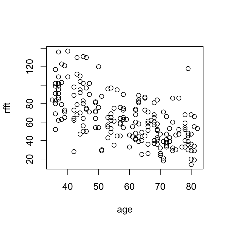
Sometimes it is handy to adjust the plot labels:
# change labels
plot(rfft ~ age, data = prevend,
     xlab = 'age', ylab = 'RFFT score')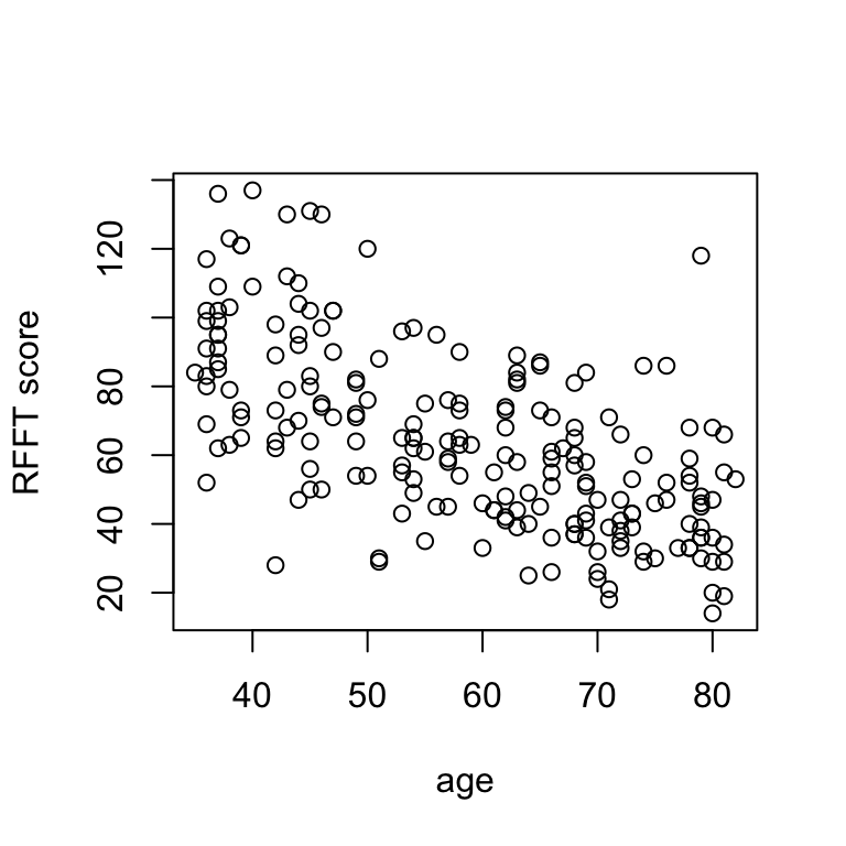
Scatterplots allow for visual assessment of trend. A trend is:
- linear if scatter seems to follow a straight line;
- nonlinear if scatter does not follow a straight line;
- positive if \(Y\) values increase from left to right;
- negative if \(Y\) values decrease from left to right.
In the example above:
There is a negative linear relationship between RFFT score and age, suggesting cognitive function decreases with age.
The direction and strength of the linear relationship can be measured directly by the correlation coefficient:
# correlation between age and rfft
cor(prevend$age, prevend$rfft)
[1] -0.635854Generally, the stronger the correlation (closer to 1 in absolute value), the easier it will be to visualize a line passing through the data.
Hand-fitting lines
I’ve written a function called hand.fit that allows you to construct a scatterplot and easily add a line by specifying the slope and intercept.
# variables of interest
age <- prevend$age
rfft <- prevend$rfft

# example usage: horizontal line at y = 80
hand.fit(x = age, y = rfft, a = 80, b = 0)
Your turn
Experiment with the intercept a and the slope b until you find a pair of values that seem to reflect the trend well. Interpret the relationship described by the line.
# adjust a and b until the line reflects the trend
hand.fit(x = age, y = rfft, a = 80, b = 0)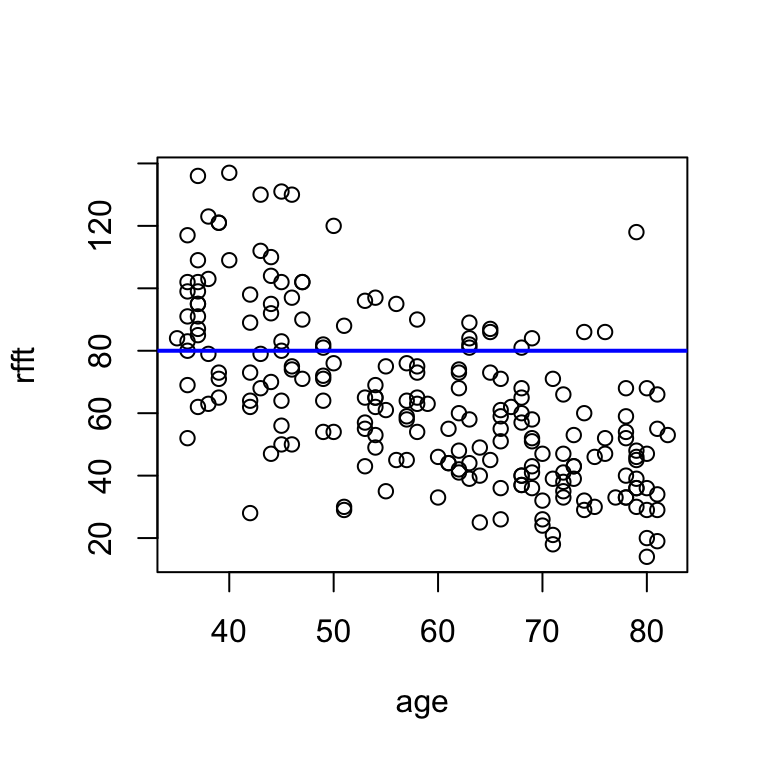
Solution
There are many possible lines that visually fit the data well. One possible solution:
# adjust a and b until the line reflects the trend
hand.fit(x = age, y = rfft, a = 145, b = -1.3)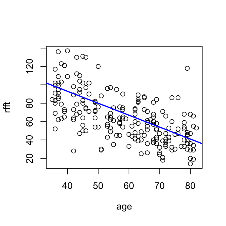
This line says that mean RFFT score decreases by 1.3 points with each additional year of age.
Residuals
How good is one line relative to another? Residuals will help us answer this question.
A residual is something left over; in this context, the difference between the line and a data point. There is one residual for every data point. Adding the argument res = T to the hand.fit(...) function will show the residuals visually as vertical red line segments.
# visualize residuals
hand.fit(x = age, y = rfft,
         a = 80, b = 0, res = T)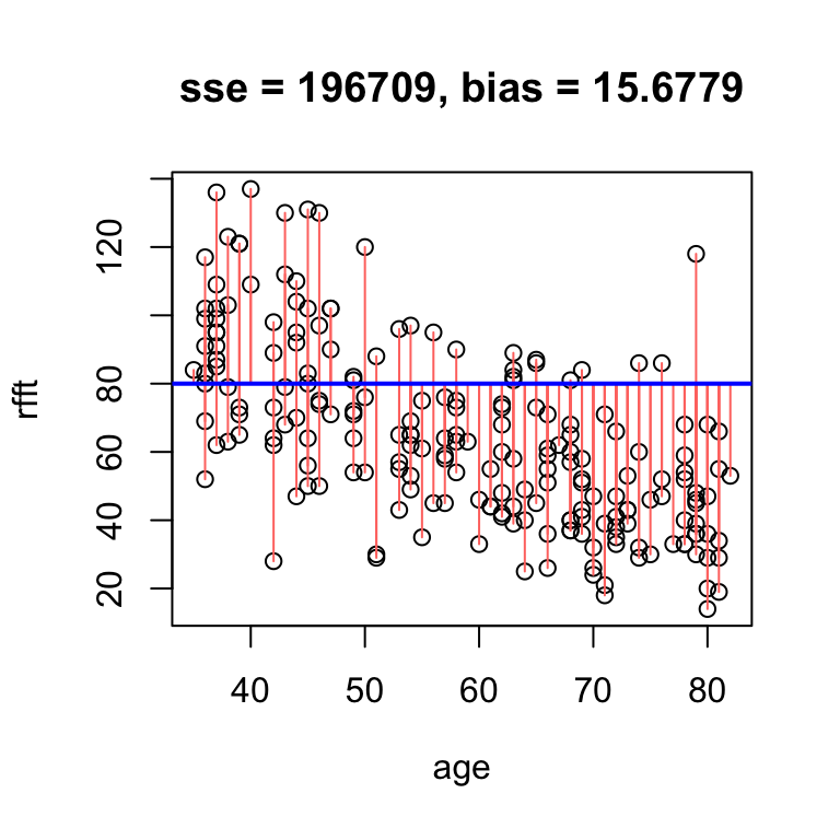
The metrics printed above the plot are:
- SSE: sum of squared residuals, which measures the spread of data about the line
- bias: average residual, which measures whether data tend to lie above or below the line
In the example above, the bias of 15.68 means that on average, the line overestimates RFFT score by 15.68 points. The SSE is trickier to interpret, but smaller is better.
If we increase the intercept, we will overestimate even more often, and thus increase the bias:
# obvious positive bias
hand.fit(x = age, y = rfft,
         a = 90, b = 0, res = T)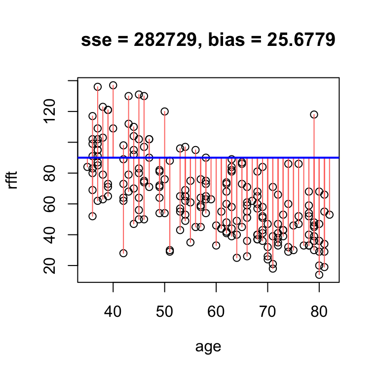
If we get the trend wrong, we inflate the SSE because more residuals become large:
# large residual spread
hand.fit(x = age, y = rfft,
         a = 90, b = 0.5, res = T)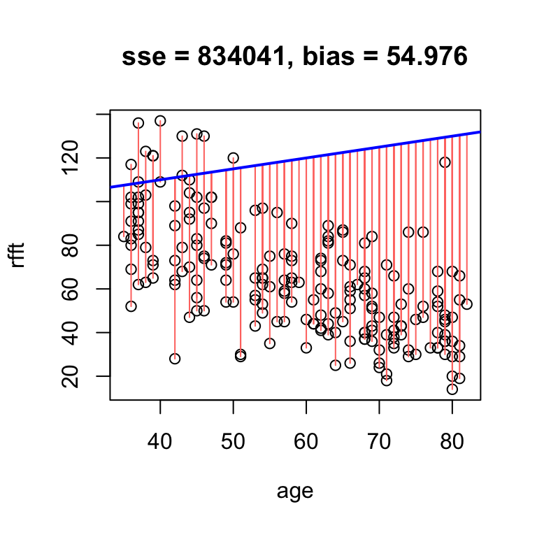
So the smaller the bias and SSE, the better the line fits the data.
It is a mathematical fact that whenever the line passes exactly through the point defined by the sample mean of each variable – i.e., the point \((\bar{x}, \bar{y})\) – the bias is exactly zero.
# no bias but high error
hand.fit(x = age, y = rfft, a = mean(rfft), b = 0, res = T)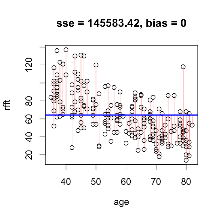
The reason the bias is zero is that the residuals balance each other out in the average. We say that the line is unbiased.
Omitting the intercept altogether in the hand.fit(...) function will constrain the line to pass through the center and ensure it is unbiased.
# unbiased line
hand.fit(x = age, y = rfft, b = -1.2, res = T)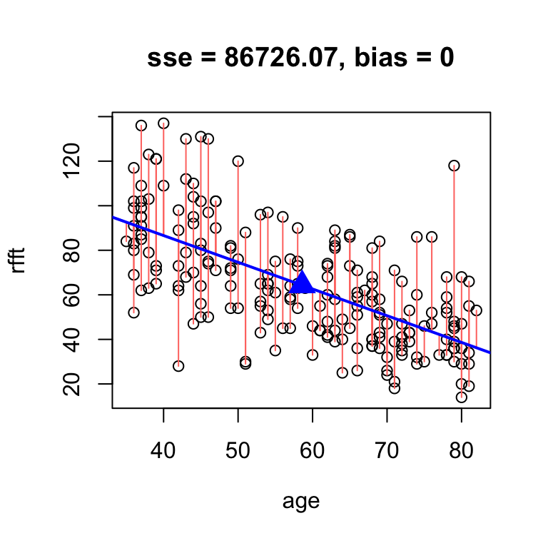
intercept     slope
 134.6375   -1.2000
Notice that now the function also returns numerical output giving the slope and intercept of the line – this allows you to see the value of the intercept since it is not supplied directly.
Now finding a “good” line amounts to fine-tuning the slope until SSE reaches a minimum.
Your turn
Fine-tune your solution from before until you find a line with smaller SSE.
Solution
# fine tune slope to minimize sse by hand
hand.fit(x = age, y = rfft, b = -1.19, res = T)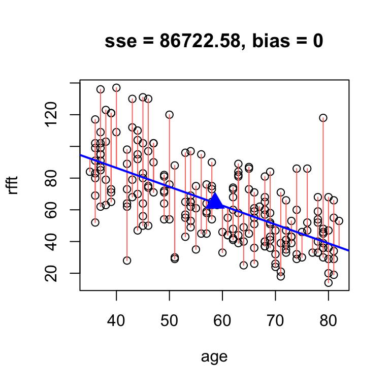
intercept     slope
 134.0515   -1.1900
There is an analytic solution for the slope of the best unbiased line:
\[ a = r\times \frac{s_y}{s_x} \]
You should see that your guess above was pretty close:
# analytic solution
hand.fit(age, rfft, res = T,
         b = cor(rfft, age)*sd(rfft)/sd(age))
 intercept      slope
134.098052  -1.190794
We call this the least squares line because it minimizes the squared residuals. It is the standard estimation technique for linear models.
To compute the least squares line in R, use the lm(...) function (short for “linear model”):
# least squares line
lm(rfft ~ age, data = prevend)
Call:
lm(formula = rfft ~ age, data = prevend)

Coefficients:
(Intercept)          age
    134.098       -1.191